“How much money will we make if we invest in building your proposal?”
This seems to be the question in the bank of everyone’s mind. Data driven decisions are gradually becoming the norm in every industry. However within the design industry it is not always as straight forward to measure ROI. I know I have been asked many times for concrete numbers that would validate the business investment in a design proposal.
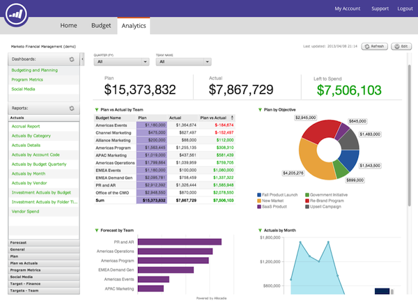
In the case of UX, I believe we can use information dashboards to surface user statistics and patterns of behavior to generate concrete numbers displaying the value of UX. The article The PyschologyBehind Information Graphics by Shilpi Choudhury touches on an interesting subject: Information Dashboards. Dashboards can add more clarity around unknown areas and illustrate them in an easily digestible way. Choudhury states that if people are in an unknown environment, they will panic. Hence, people have an inherent need to feel in control of their environment in order to better plan for the future. In using information dashboards we are shedding light on a specific “environment” and thus giving the viewer a sense of control.
Choudhury continues to outline that most information dashboards use a three-pronged strategy to establish a sense of control:
- Giving you a clear understanding of things to help establish a feeling of certainty
- Giving you the resources to predict and plan for the future
- Helping you complete critical tasks in time to avoid last-minute panic
- Firstly: Data visualisation is used to gain actionable insight on otherwise difficult to digest data,
- Secondly, to have the ability to communicate those insights to anyone. Communication is as important as the insights themselves. Combined, these give you the control you need to steer a project in the right direction


