
The first time I flew RyanAir, I vowed never to fly it again. Alas, with their unbeatable prices and remote “Stockholm” airport located so close to my parents farm, I fell prey to their trap and now use the airline regularly. For years I have booked, checked in, and flown RyanAir yet I have not seen any significant improvement in the in person user experience.
Granted, some credit is due. In 2013 they did update the website in order to allow the user to complete a task efficiently. Their website is now quite well-designed:
- Decreasing the amount of aggressively loud advertisements on the home page so that the primary function of the website is easily discoverable: to book a flight.
- Creating an easy to follow guided UI for users to manage their booking step by step
- Removed the luminous yellow making it slightly easier to actually complete a task
- Joined the flat-style crusade and removed their rounded corners, drop shadows, and gradients, making the ryanair brand seem a smidgen more refined.
RyanAirs original design catered to users who go to the site and be lured in by seemingly too-good-to-be-true-deals. While this may have been a valid user case decades ago when people trusted companies would genuinely give them such a deal without a catch, nowadays this is not the case. Users primarily go to the site in order to start planning the logistics of a trip they already have in mind, and expect to find affordable flights.
There are two points I would like to add to RyanAirs to-do list that would improve the UX of their check in section of the site.
The Date Picker
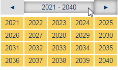
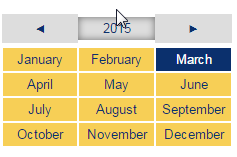
Mr. Ryanair, why do you feel the need to reinvent the wheel? A grid of buttons does not match my mental model of time being chronologically linear. It is difficult to find the date I want at a glance. I have to scan through a colorful grid both left right and up down. Furthermore I am forced to take a very silo approach to choosing my passport expiration date: First Year, then Month, then Date. What if I want to start with the day? European passports show dates in this format: DD/MMM/YYYY.
Don’t Insure me
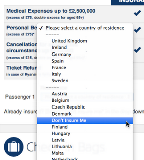
My second suggestion would be on topic of allowing the user to choose travel insurance. Or should I say… trick the user into buying insurance. The UX is set up in such a way that the user is asked which country he/she wants to get travel insurance from, rather than starting with the obvious question: Do you need insurance? The user must scroll through countries and alphabetically find the sentence “Don’t Insure Me” in order to proceed through the RyanAir jungle.
I’d like to dedicate this post to all passengers who have had to endure the distinct infuriating rage unique to RyanAir flights.
Some more links:
http://uservision.co.uk/2013/11/ryanair-homepage-makeover/
Tags: Experience Design, Usability, UX





The Ryanair lot have done some really good work on their site. However there are many things they need to rework on. One of the most annoying is that their site isn’t responsive. I know they have an app (for Adnroid at least) but this doesn’t mean their site shouldn’t work on a mobile device.
Agreed, they really have done a lot since they first came out. The UX is quite nice now! Good point on it not being responsive. For such a highly trafficked website it really should be.
Although I must admit, I am still working on my site being responsive… (shameful that it isn’t, I know)
100% agree with Insurance it’s pretty weird actually.
Really weird. Wonder if they will ever change it, or if they are actually making a profit based on people mistakenly choosing their country rather than “No Insurance”
You have some really good posts and I believe I would be a good asset. I’d love to write some articles for your blog in exchange for a link back to mine. Please send me an e-mail if interested. Thanks!