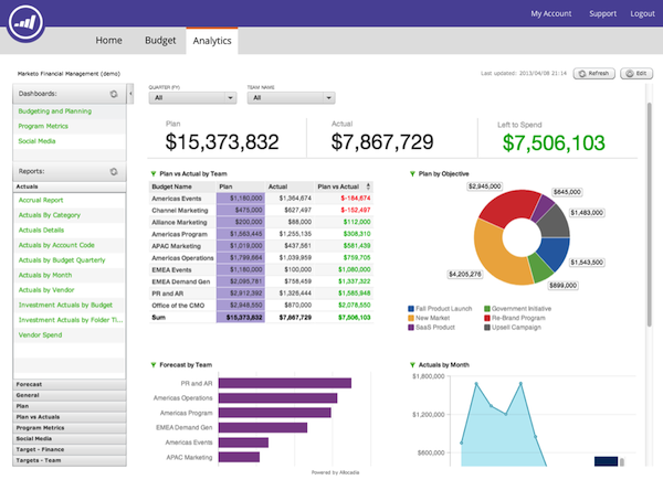
Websites and apps all have an interface. This interface is your golden ticket to the front row seat, literally directly facing the user. It is where the user comes to digitally interact with your product or service. Needless to say, that interface needs to work. And it needs to work well.
So where do we begin? Well, as with every problem: Start with the question. I know there are many questions that arise when you take a step back to evaluate your website/app. Personally I’ve heard a plethora of them, and I always found that each and every one of them are relevant. Questions such as:
- Does it solve the problem?
- Does it fit into the users journey?
- Does it support the users needs?
- Does it work…?
- Is it easy to use?
- …
But I have found that a lot of these questions can be distilled down to into two simple ones:
- Is it useful? An interface needs to provide the relevant functionality in order for the user to complete the desired task.
- Is it usable? The user must be able to easily and efficiently be able to complete the task without any sense of frustration
How to Improve Usefulness
Usefulness pertains to the functionality of the system. Firstly, you must first understand how useful the website/app is to your users. Is it meeting their needs, goals and desires? In order to do this, you must know who your users are, how the product/service fits into their life, and lastly evaluate the gateway to the products and services: The interface. The best way to do this is to conduct ample amount of user research, understanding how they will use the product/service, and how they will use the interface. One method used by UX designers is called Contextual Inquiry, which is an ethnographic interview method where users first are asked a set of standard questions and then observed while they work in their own environments. Ideally, this should be conducted before a website/app is built, but can also be used when re-evaluating its usefulness to ensure it is relevant.
How to Improve Usability
Usability pertains to how easy it is for the user to complete their task. If we know the functionality is relevant, then the next step is to ensure that the user can easily use it. One industry standard way of evaluating usability of a website/app is known as conducting a Heuristic Evaluation.
A heuristic evaluation involves a structured appraisal of an application or website interface using basic usability principles known as “the heuristics”. It is an analysis of how usable your system is. Typically a heuristic evaluation is conducted at the start of a project, in order to gain insight into any problem areas within the UI.
So how can you do it?
Firstly, you need to define the important user tasks of your website/app. Secondly, step by step go through the workflow in the UI completing these tasks, while evaluating each step against the heuristics. This process will help flag any issues that affect how the user uses the system and ultimately lead to a more usable system.
What are the heuristics?
The most used heuristics are the ones defined by Jakob Nielsen, an industry leader in User Experience design, and the full list and description of each can be found here: http://www.nngroup.com/articles/ten-usability-heuristics/
Nielsens language a can be tricky to understand how to directly apply to software. In the book Undercover User Experience Designhttp://undercoverux.com/, Cennyd Bowles and James Box have distilled down Nielsens Heuristics into a more digestible read. More specifically, they have outlined what questions we should be asking when evaluating a site or an application.
Bowles & Box Heuristics:
- Made for humans? Is the site/app relevant and useful? Is it enjoyable? Does it match users’ mental models—that is, their understanding of how the site should work? Does the site speak in user-friendly language? Does it offer the right level of user control?
- Does the site/app prevent errors? When errors do occur, are they clearly explained and easy to recover from? Does it minimize the user’s mental workload?
- Is the text legible? Does the site/app cater to color-blind users? Is there unnecessary animation? Does it work with assistive technology such as screen readers?
- Self-evident. Is it clear what and who the site/app is for? Is it easy to navigate? Is the layout logical, with the most important information prominent? Do the icons and graphics make sense?
- Is it consistent? Does it use known web conventions? Are there good defaults for user input? Does it remember user preferences?
- Are text, imagery, and structure concise? Is it responsive, giving good feedback? Does it prioritize the most important tasks?
- Is the site/app accurate? Is its content up-to-date? Are there any bugs? Does the site keep its promises?
To conclude, hopefully you have gained insight into how to improve an existing website/app. A good starting point is to first ask how useful it is, and secondly, how usable it is. If you can ensure usefulness and usability, then you will have a strong interface.
Tags: Usability, UX resource


Spot on with this write-up, I honestly believe this site needs a great deal more attention. I’ll probably be returning to read more,
thanks for the information!
Excellent blog! Do you have any tips and hints for aspiring
writers? I’m hoping to start my own website soon but I’m
a little lost on everything. Would you propose
starting with a free platform like WordPress or go for a paid option?
There are so many options out there that I’m totally overwhelmed ..
Any tips? Cheers!