
Working in within investment banking, I have become well-aware of one of the most widely used applications by sales and traders: The Bloomberg Terminal. The interface has not drastically changed for a long time, and most users are too accustomed to the current UI to want any big changes.
Needless to say, it would be any UX designers dream to revisit the interface and attempt the challenge of displaying very data-heavy, time-sensitive information in a quick-to-digest interface. It is a productivity application, and as such, it has to work efficiently rather than be glossy. Information visualization skillz are key.
3 companies, IDEO, Ziba, and Thehappycorp were asked to rethink what Bloomberg Terminal could be and came up with three vastly different concepts:
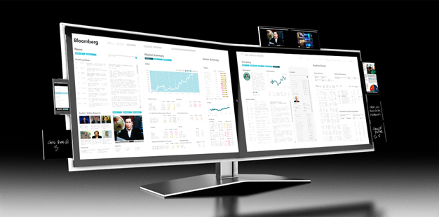
IDEO:
IDEO came up with its concept before the iPhone, using an electronic notepad that is re-used like a virtual post-it. The device would allow users to take a small-scale Bloomberg terminal device beyond their desk (Cue iPhone/iPad). Personally I find it an interesting take on merging new technology with the Bloomberg terminal. IDEO also proposed a gaming-inspired system that would track and display the expertise of users around the world, in response to traders’ behavior and their pride in navigating the complex terminals. In my opinion, IDEO concept exhibits a good example of how to incorporate gamification into finance.
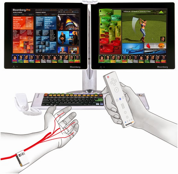
Thehappycorp:
Thehappycorp concept is interesting in that it “thinks outside of the box” and looks at how to gamify finance. However, the concept fails to recognize that other applications are used in tandem with Bloomberg. Switching between a hand held remote to use the computer mouse would decrease efficiency and cause frustration. Furthermore, the fancy design elements could get in the way of digesting information fast: a compromise not worth making.
Ziba:
Ziba design is very different from IDEO. It is important to simplify the interface, not the data. Omitting information in the interest of beautiful design but at the expense of efficiency is a trap many designers fall into. In my opinion this is where Ziba falls short.
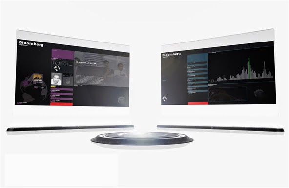
“Simplifying the interface of the terminal would not be accepted by most users because, as ethnographic studies show, they take pride on manipulating Bloomberg’s current “complex” interface. The pain inflicted by blatant UI flaws such as black background color and yellow and orange text is strangely transformed into the rewarding experience of feeling and looking like a hard-core professional.”
Tags: multi-platform
Related Posts
-

Designing for an evolving customer base within a...
-
The Importance of UX/UI in Enterprise Applications
To Be or Not To Be (A Coder & Designer Hybrid) Next Post:
Video: The Art of Data Visualization
What is UX Design?


Tag Cloud
Twitter feed
Twitter outputted an error:Could not authenticate you..